The Daily Grind brand guidelines
Brand guidelines for a coffee brand, from logo to layout.
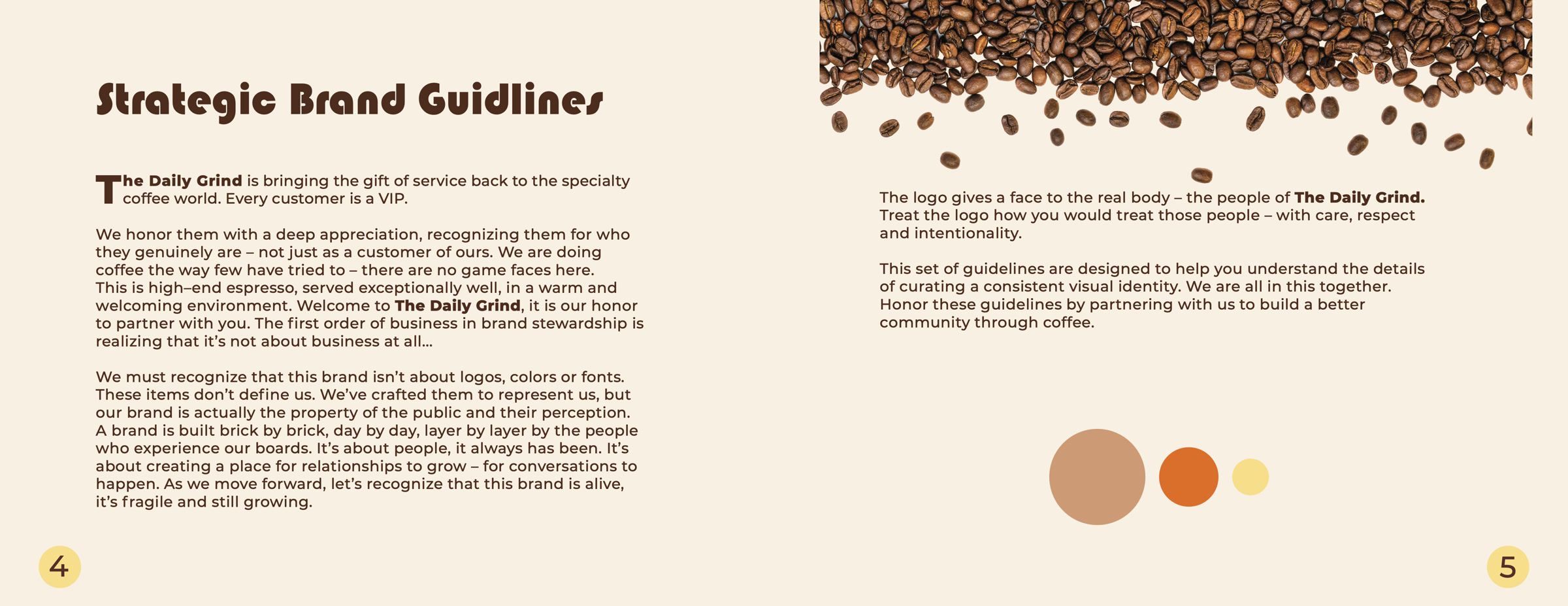
Strategy: Specialty coffee with the gift of service: every customer is a VIP.
Challenge
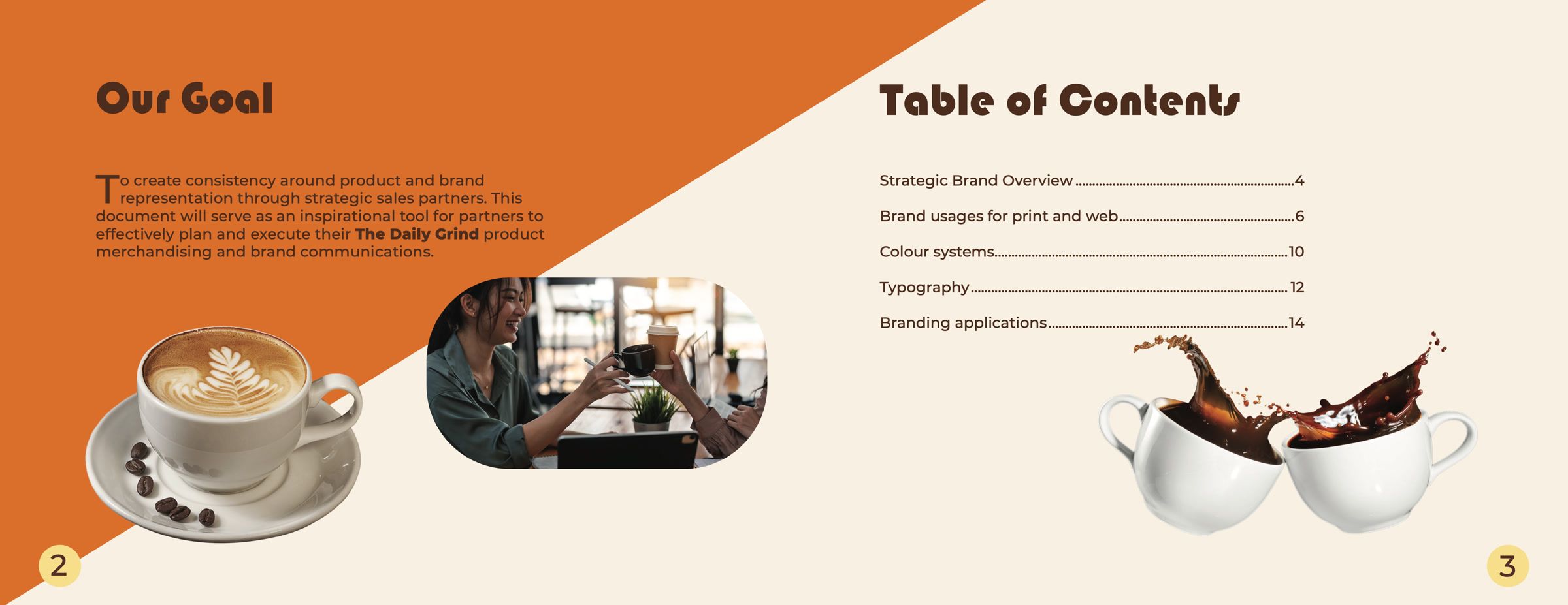
The Daily Grind needed one guide its sales partners could follow, so the brand looks the same on every shelf, cup and screen. The goal: create consistency around product and brand representation, and inspire partners to plan their merchandising and brand communications.
Insight
A brand isn’t its logo, colours or fonts. It belongs to the people who experience it, so the guide asks partners to treat the logo the way they would treat those people: with care, respect and intentionality.
Process
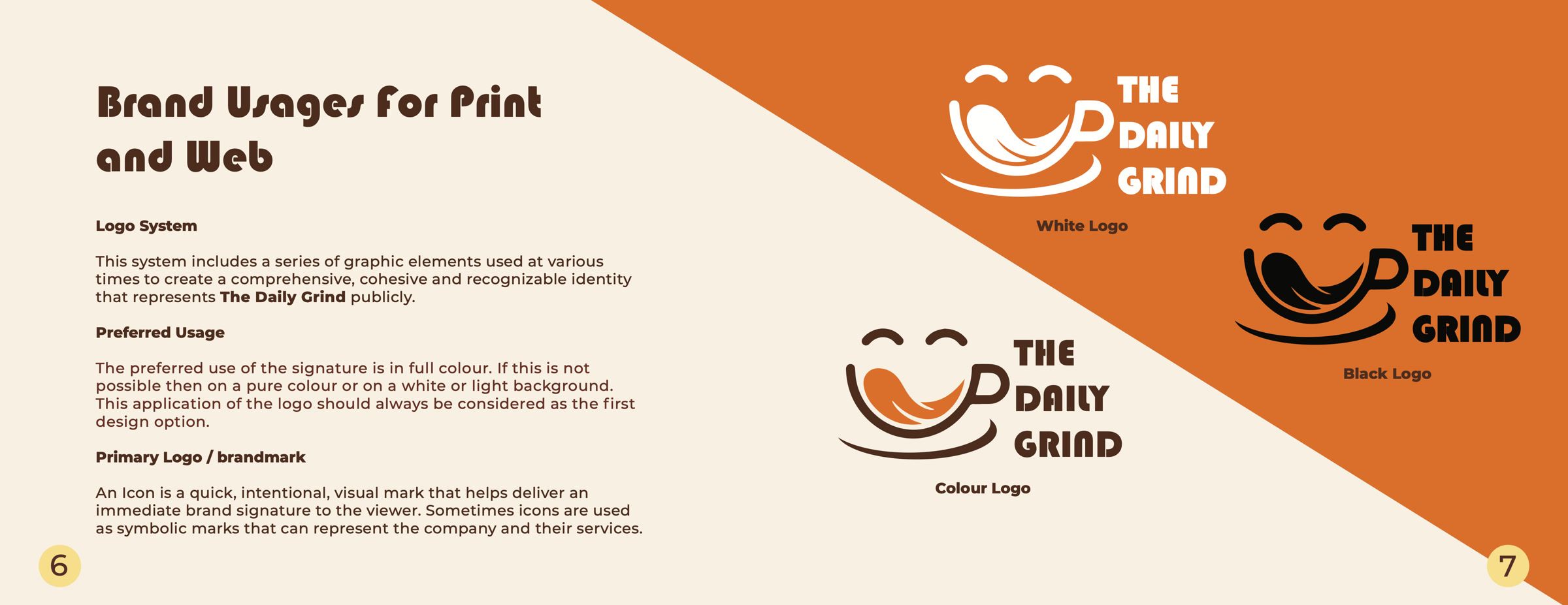
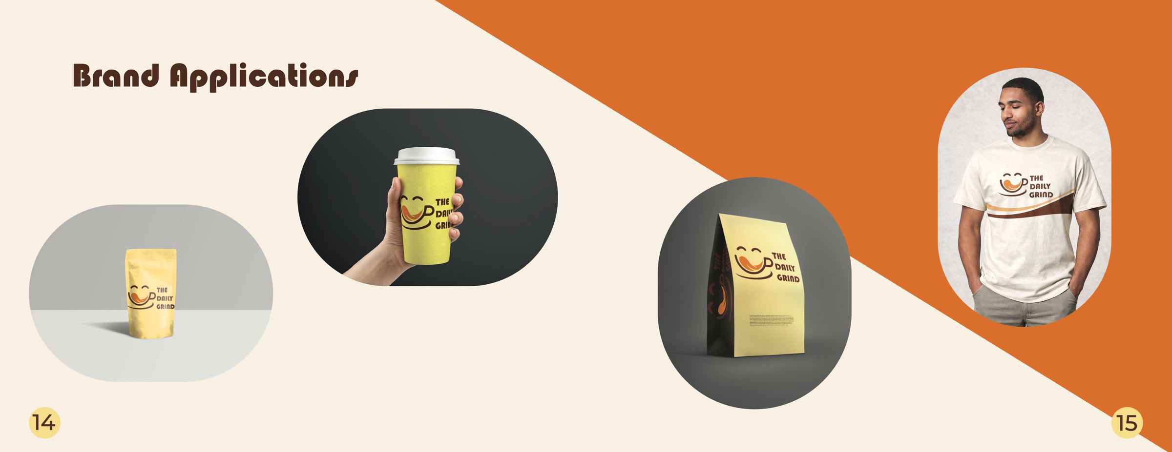
I started with a mood board, then drew the logo in Illustrator in colour, black and white versions, and built each misuse example as its own file. Photography and product mock-ups (a paper coffee bag, a takeaway cup and a T-shirt) were prepared in Photoshop, and the book was laid out in InDesign over several rounds in March and April.
Solution
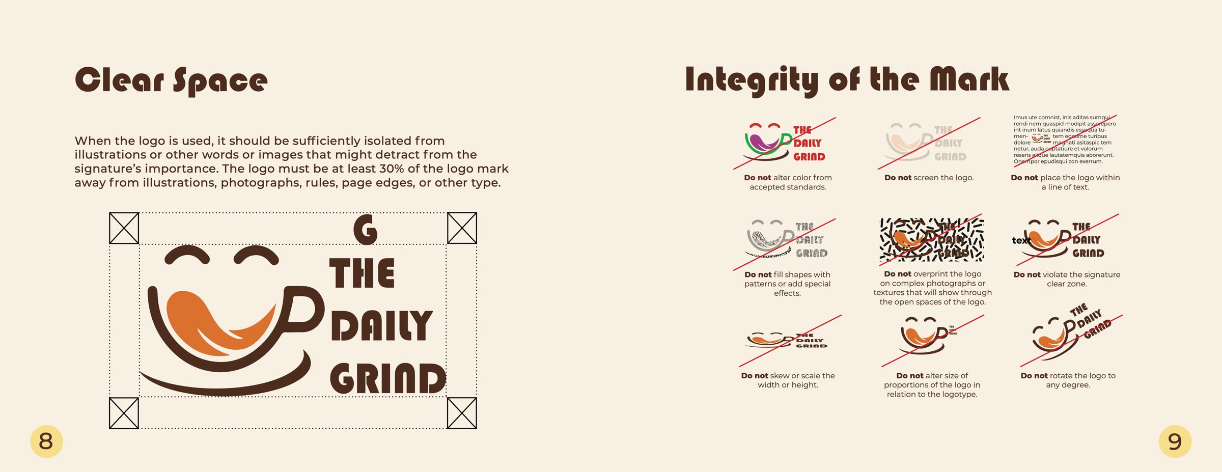
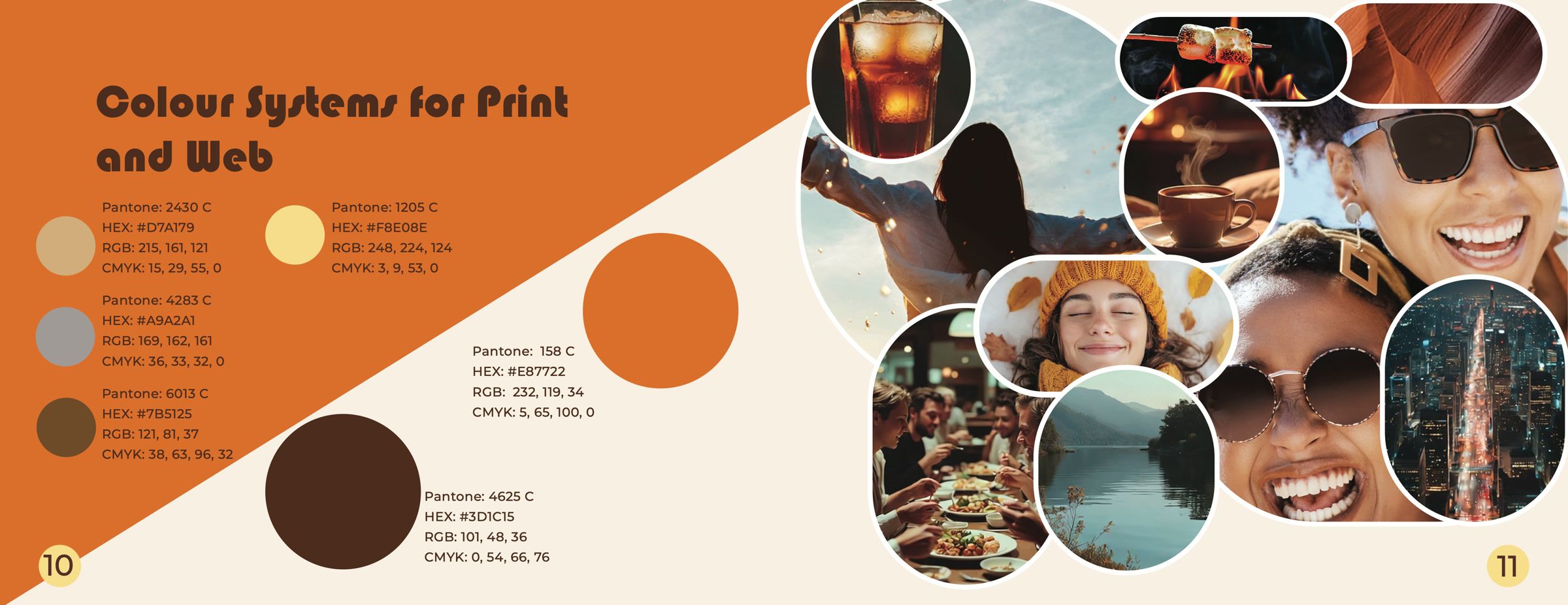
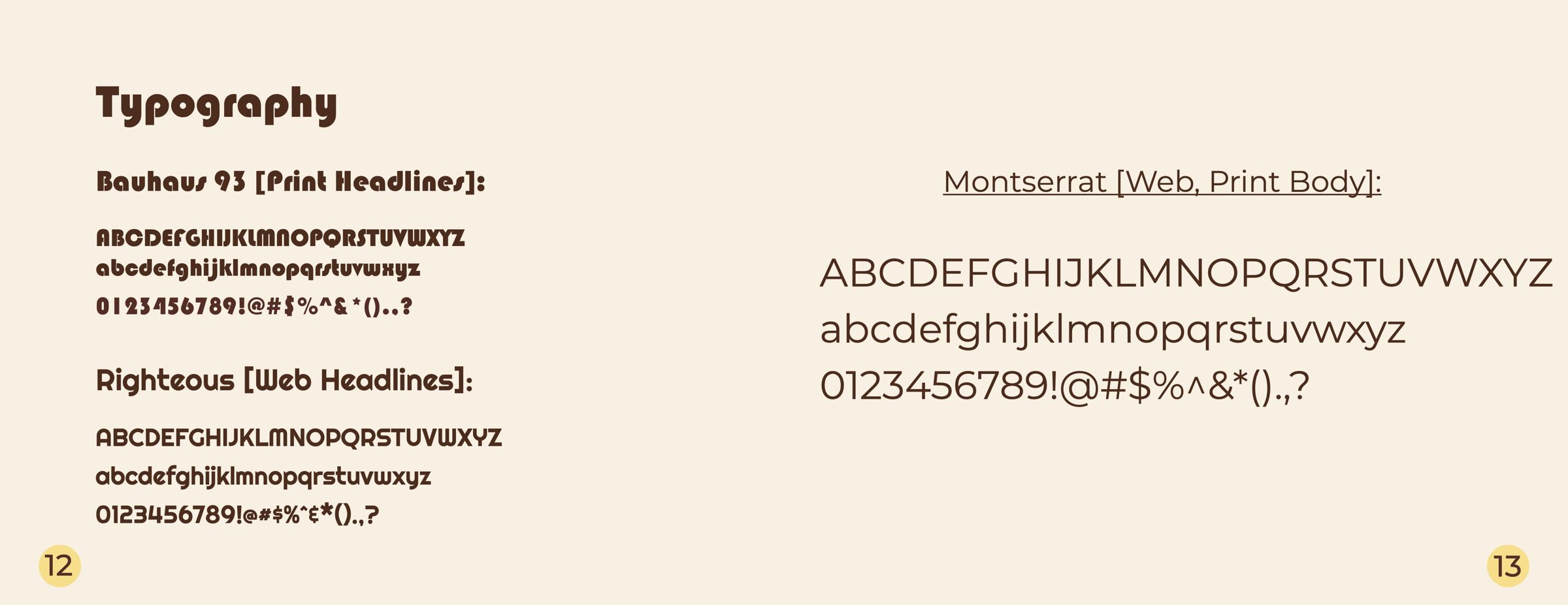
A 16-page brand book: a strategic overview; the logo system in colour, black and white; clear-space and misuse rules; six colours with Pantone, hex, RGB and CMYK values; Bauhaus 93 for print headlines, Righteous for web headlines and Montserrat for body text; and applications on a pouch, a takeaway cup, a coffee bag and a T-shirt.
Outcome
A finished 16-page brand book, exported as reader spreads for screens and as printer’s spreads for production.