Araik Movsessian Design: brand identity
A personal brand system built from the AM monogram.
Strategy: A personal brand for a multidisciplinary designer: clear, human-centred work on screen, in motion and in print, carried by one mark and one accent colour.
Challenge
I needed one identity that could hold everything I make: UX and interface design, motion and 3D, front-end development and brand strategy. It had to feel personal without leaning on a picture, work at 40 px on a screen and 12 mm in print, and stay accessible on every surface.
Insight
Design, at its core, is translation: turning an idea into something a person can actually use. The identity had to show range through restraint: one idea, one accent, nothing left unfinished.
Process
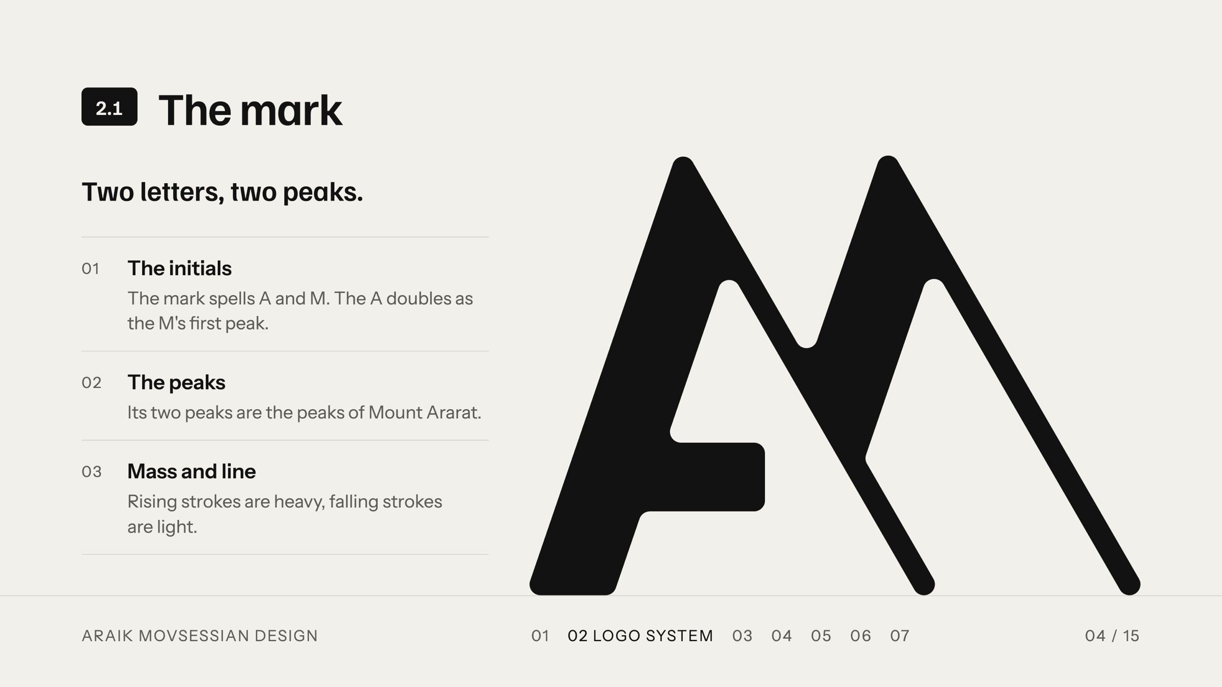
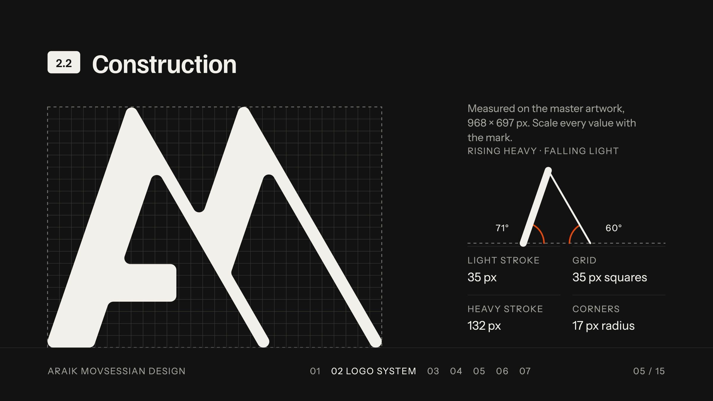
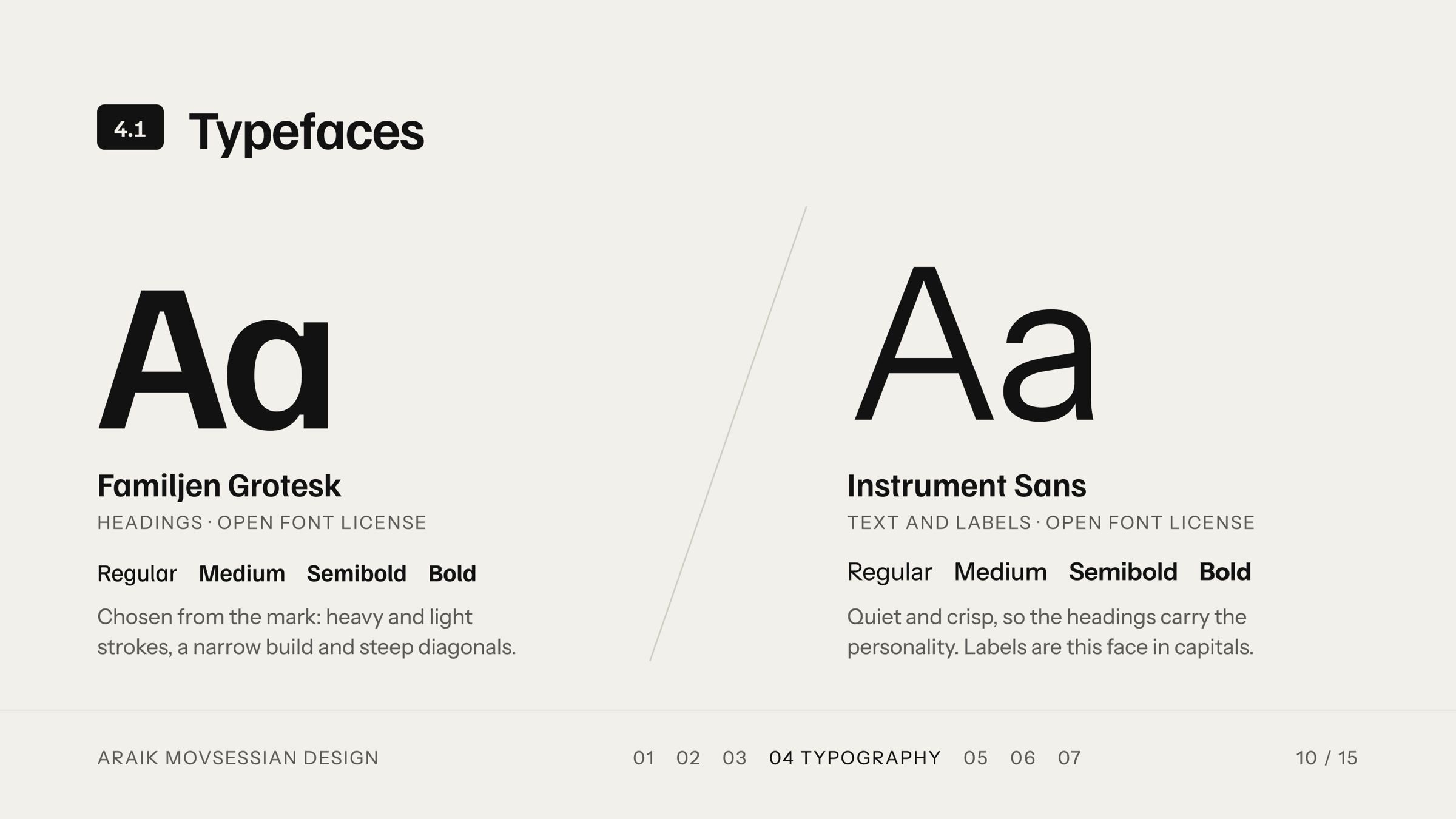
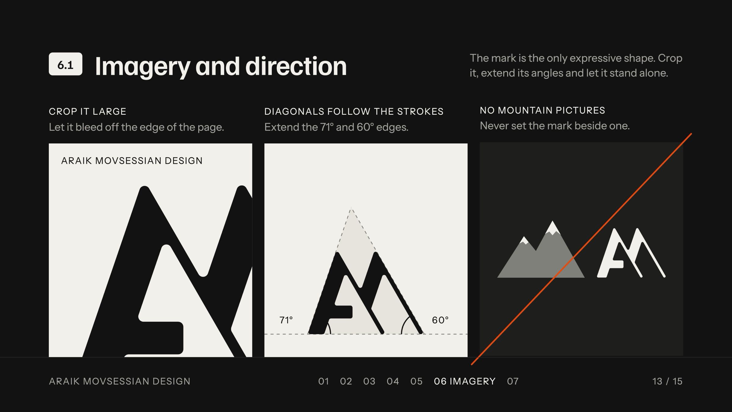
I built the mark from my initials. The A doubles as the M’s first peak, and the two peaks are the peaks of Mount Ararat. I measured it on a 35 px grid: heavy rising strokes, light falling strokes, 71° and 60° angles and 17 px corners. Familjen Grotesk was chosen to echo those strokes, with Instrument Sans for text.
Solution
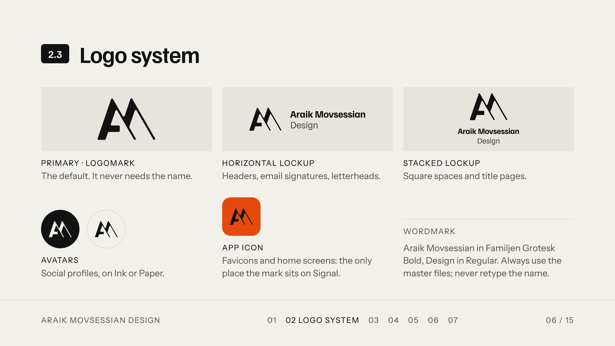
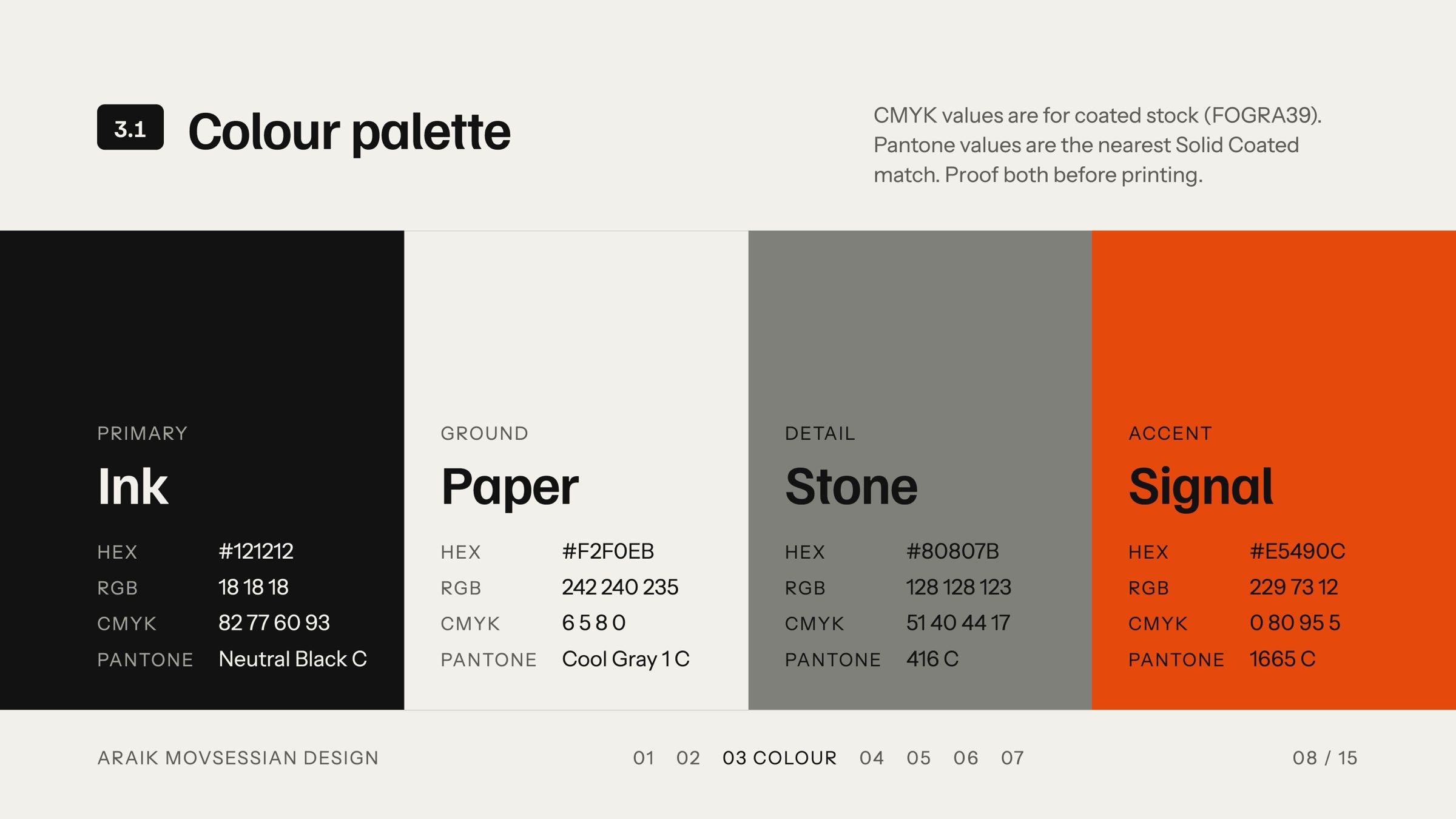
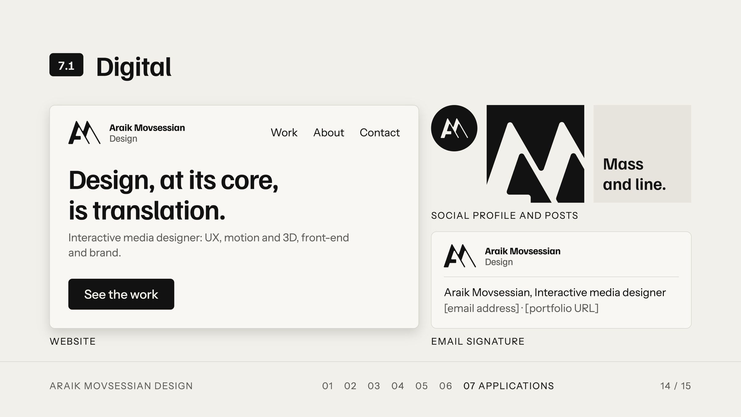
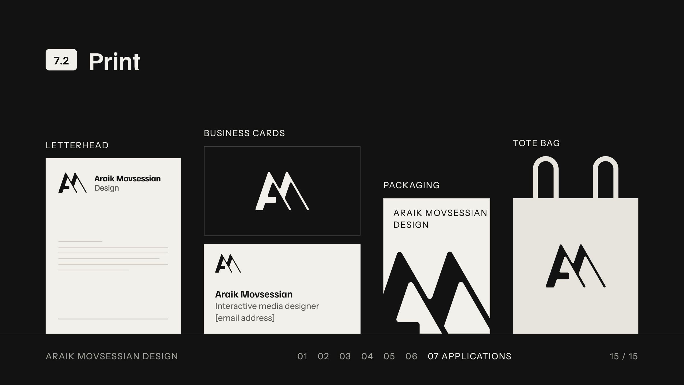
A complete system in a 15-page guideline: logomark, lockups, app icon and avatars; four colours (Ink, Paper, Stone and Signal) with contrast rules; a type hierarchy; voice and tone; imagery rules; and applications from business cards and a tote bag to an animated logo.
Outcome
The system now runs this portfolio: its colours, type and mark come straight from the guidelines.
