360°: colour palette app
A colour app that tests palettes on real app screens.
Concept work, not affiliated with 72pt or its developer.
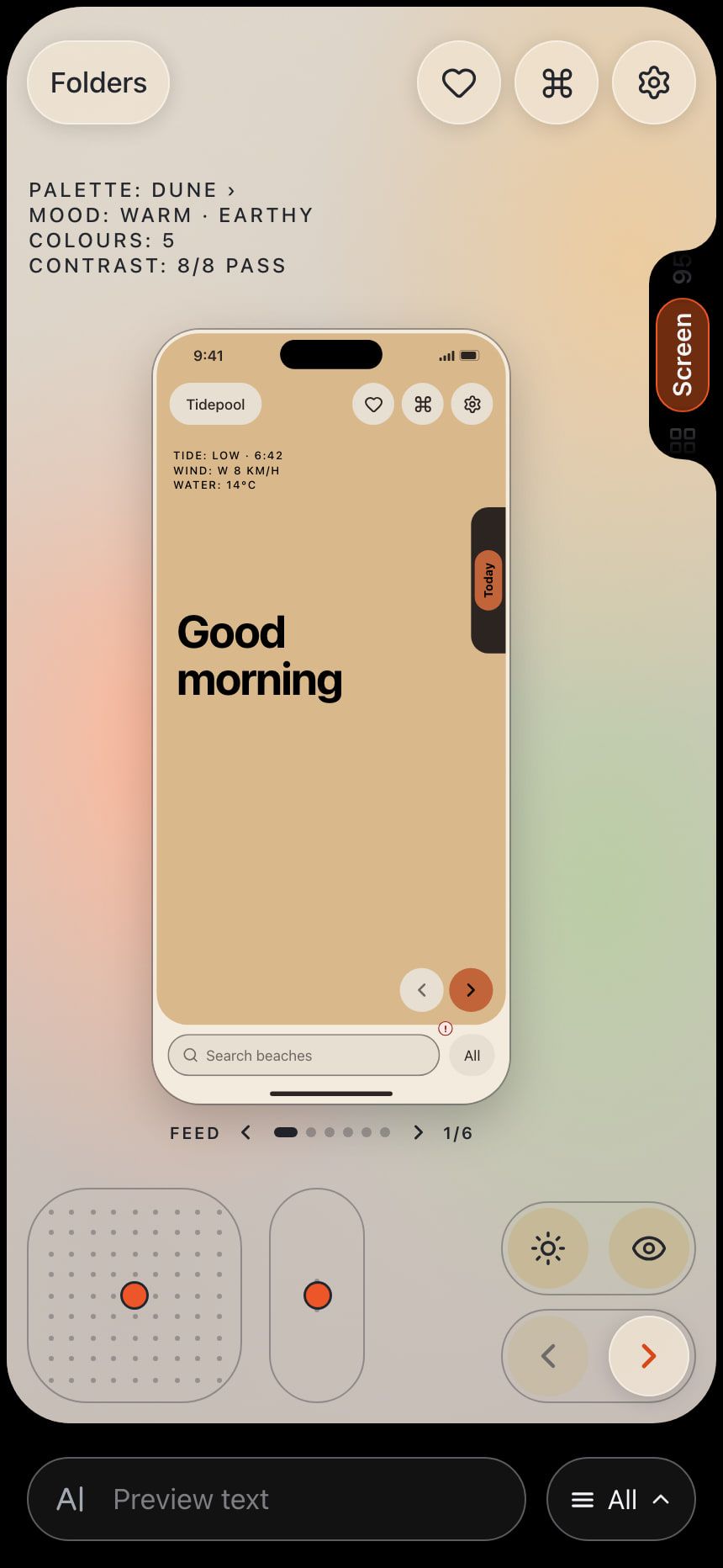
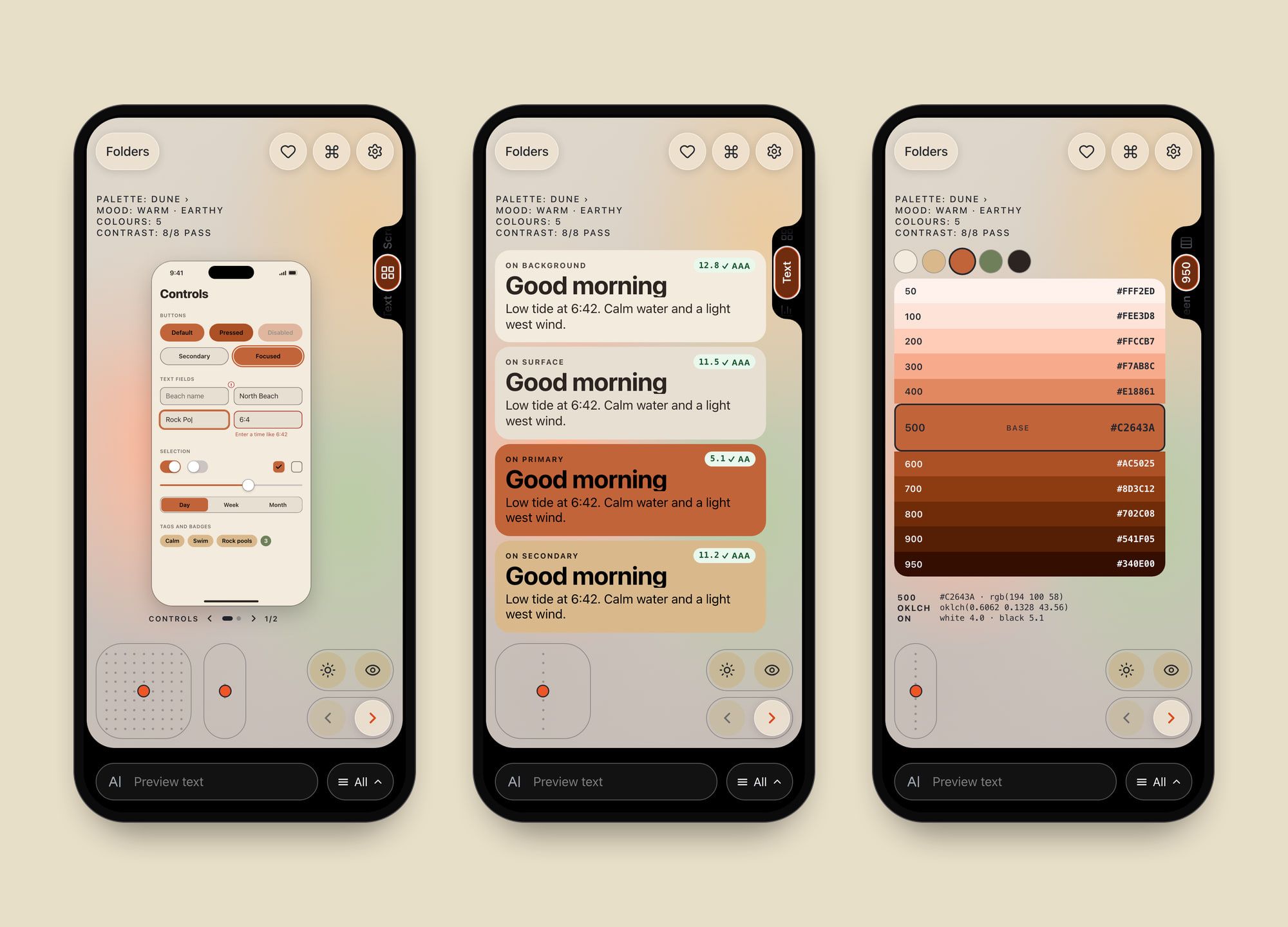
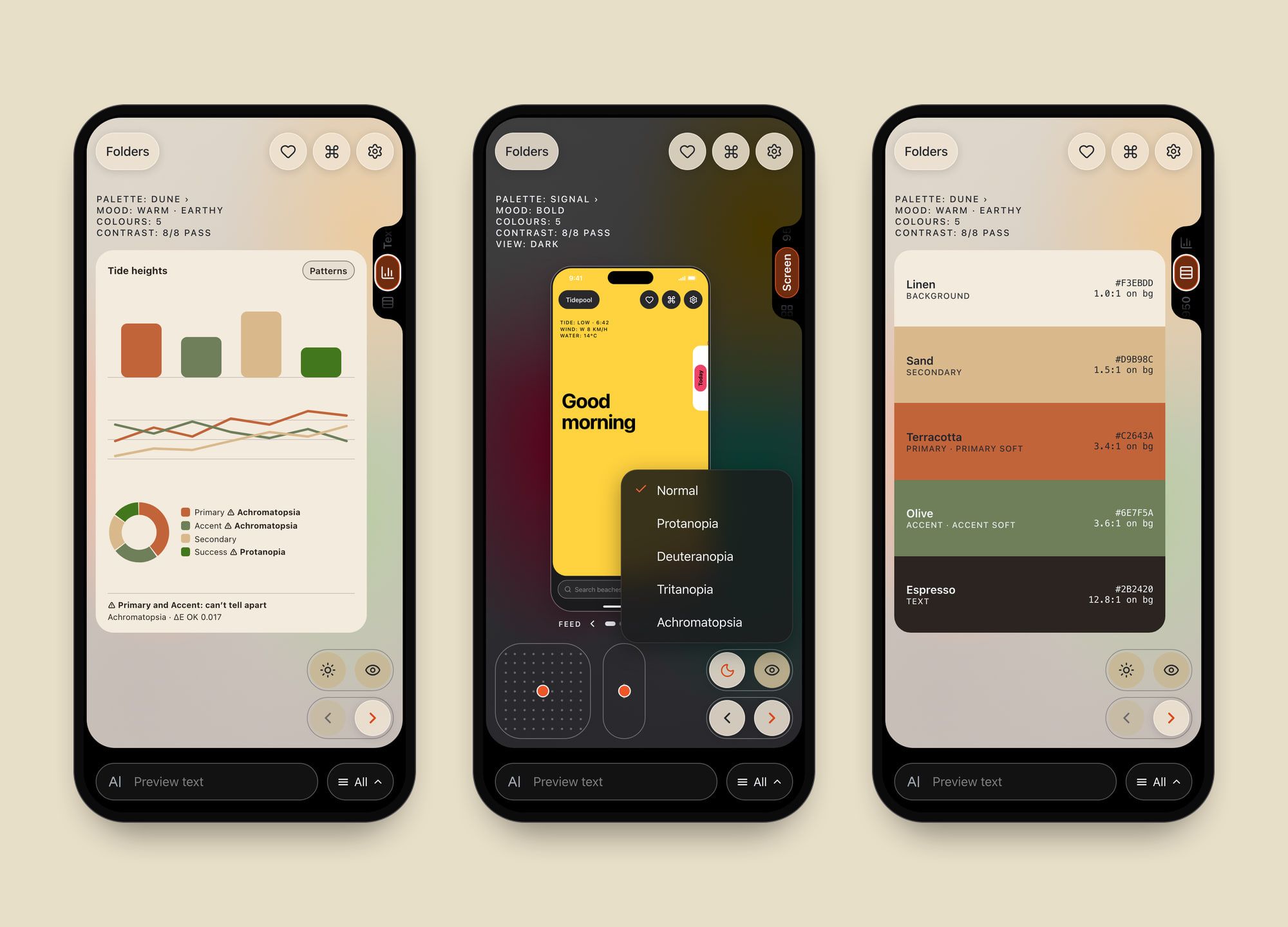
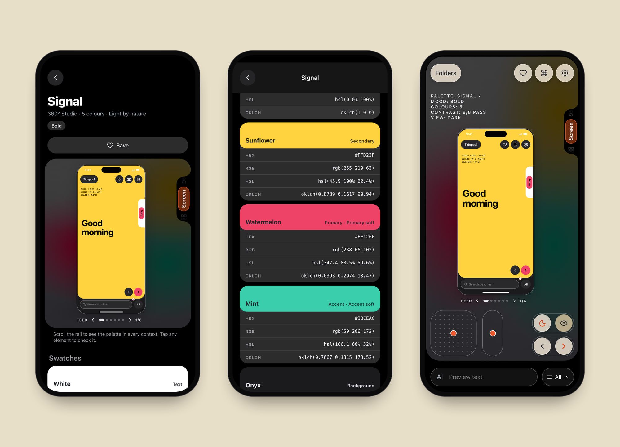
360° is a colour app for UI designers, designed as a companion to the font app 72pt: Fonts for Designers. Where 72pt shows your own words in a typeface, 360° shows a palette on a real app screen before you commit to it. Swipe through 24 palettes, and scroll the side rail to see each one as six app screens, components, text, a chart, swatches and a 50–950 scale.
Accessibility is part of the preview, not a separate report. Eight contrast checks run on every palette in light and dark, failures show on the exact element with a one-tap fix, and a vision lens simulates four kinds of colour blindness. A colour app has to pass its own checks, so 360° keeps 72pt’s look but fixes seven of its colours that fell short of WCAG contrast. Palettes export to Xcode colour sets, Figma variables, CSS, Tailwind and SwiftUI. It’s a web prototype styled as an iOS 26 app: full screen on an iPhone, inside a phone frame on a laptop.